Blue Bottle Coffee —
A specialty coffee roaster with cafes in LA, SF, NYC, and Japan.
Project TL;DR summary
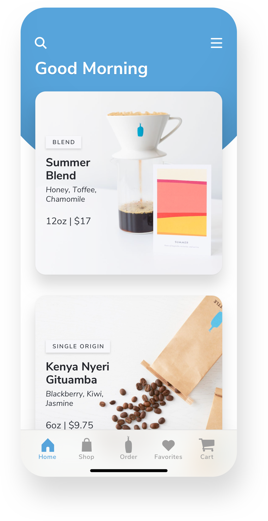
I designed a mobile app for Blue Bottle Coffee that would allow their customers to order ahead of time, shortening wait times. I did this by conducting user research, creating design planning artifacts, creating high-fidelity mockups, performing user testing, and finally creating dev friendly deliverables.
Project Objective
Design an easy way for customers to order coffee online via a mobile device from the trendy coffee chain, Blue Bottle Coffee.
User Research —
Asking Questions
To get insights into how users order ahead via a mobile device, I conducted an impromptu discussion with friends and family around their experiences with mobile food ordering apps. I narrowed my questions around three main aspects:
— How important is the ability to order coffee ahead of time to them using a mobile app?
— What’s their level of experience with using a mobile device, for food ordering or rideshare?
— What were their biggest pain points when it came to ordering coffee from a coffee shop?

Analysis —
User Pain Points
Based on the user research, these are the core problems this product aims to solve:
Conservation of time — When comparing coffee house chains, those that allow users to order ahead of time are perceived as being faster.
Reduce friction — Due to the popularity of Blue Bottle Coffee, the long lines can become daunting.
Becoming a norm — While a majority of fast casual and coffee house chains are allowing users to order ahead of time, users are beginning to expect this kind of mobile experience.
The Problem
Currently there isn’t a way to place an order online ahead of time. Because of the popularity of Blue Bottle Coffee, it can easily take 10-12 minutes to get your order. With a packed work schedule, it can be hard to fit in a cup of coffee.
The Solution
Design a mobile app for users to order coffee ahead of time with minimal effort. This app should allow the user to place an order to any Blue Bottle Coffee store within a close area. It needs to be beautiful, simple and user friendly.
Ideation —
Design Planning
The next step centered around creating an inspirational mood board, roughly sketching out ideas, building out wireframe task flow and then creating a journey map that would fulfill the user requirements of the app.
— Moodboard
— Sketches
— Wireframe
— Flowchart
Design —
High-Fidelity Mockups
After researching, identifying the problem, coming up with a solution, and design planning, I was able to begin to produce hi-fidelity mockups for the app.
Feedback —
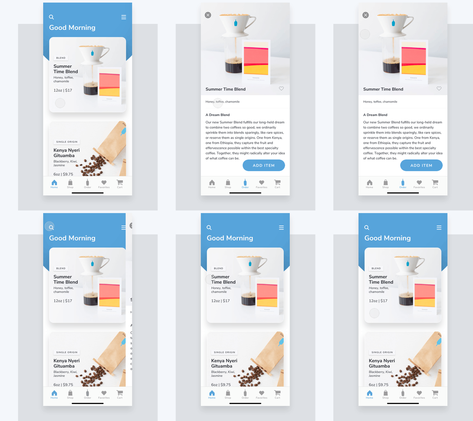
Prototyping, Testing and UI Animation
The next step was to create a working prototype within the Principle tool. This was to conduct simple usability testing to validate the designs and express complex UI animation. Edits were quickly made to the hi-fidelity screens based on useful user feedback.
— Home Screen
— Menu Screen
— Product Screen
— Selected Item Screen
Implementation —
Handoff and Asset Prep
The final step in the process was to create a design system that would consist of a library of visual design specs, components and screen level templates. Creating reusable UI components would make for a smoother handoff between design and development.
Other projects
Previous
Who: MonkeyWorks
What: Research, Information Architecture Improvements, UI Redesign
Results: An updated web-based application that can compete in a crowded market space.
Next up
Who: iCore Networks
What: User Research, Testing, Information Architecture, Wireframing
Results: A streamlined site architecture and navigation that lead to better conversion rates.


