HouseCanary —
Enhance Property Explorer reports' efficiency by 20%
Property Explorer informs your real estate decisions with contextual property valuation that lets you choose your own comps and valuation method. HouseCanary surface their sources, and recalculate property values immediately when you make adjustments to property condition, room count, or other attributes.
Project TL;DR
Given a clear mandate to boost product efficiency by 20%, our challenge was to strike a balance between preserving core features and enhancing performance. I embarked on a thorough quantitative analysis to monitor feature usage, providing valuable insights for our redesign. Through a meticulous process of card sorting, wireframing, high-fidelity prototyping and iterative user testing, we refined the Property Explorer experience, ensuring optimal usability and efficiency for our users.
Problem statement
After gaining significant traction in the market over the course of several years, HouseCanary's flagship product, Property Explorer, faced the challenge of feature bloat due to continuous additions, resulting in a subpar user experience.
Making property analysts work for a large industry segment
HouseCanary’s target customers for Property Explorer were real estate analysts, underwriters, and investors who sought interactive and intuitive tools for property valuation and comp selection.
These users valued navigating through the valuation processes using features like neighborhood heatmaps, comp selection, and the ability set their own report value.
They relied on the AVM (automated valuation model) valuation information provided by Property Explorer as part of their workflow process and considered it critical to have accurate property information.
My role in the project
As the senior product designer, I collaborated with our product managers, lead software engineer, and front & back-end developers to iterate on and test possible improvements on how our user interacted with the Property Explorer product.
Each team member had well-defined roles; I helped facilitate and conduct user testing sessions to identify necessary product improvements, as well as a quantitative analysis. I helmed the redesign process, starting from card sorting, wireframing and progressing through the creation of high-fidelity prototypes, through development implementation.
The mandate: Enhance Property Explorer reports' efficiency.
I was given a clear mandate to increase product efficiency by 20%. As we delved into identifying areas for improvement, we initially considered the possibility of depreciating lower performing features. However, our product partners later communicated the importance of maintaining the existing functionality. This revised direction posed a challenge, requiring that I strike a balance between enhancing efficiency and preserving core features. Nonetheless, I had the freedom to explore and redesign the product, ensuring that our efforts would ultimately create a valuable and improved experience for HouseCanary’s users.
Research
During the research phase, I embarked on a quantitative analysis of the existing user experience, diving into 42 tracked events. Collaborating with our talented data analyst, they developed a comprehensive Tableau dashboard to closely monitor the usage of various features within the current Property Explorer. Additionally, I conducted user interviews to gather qualitative insights and ensure a holistic understanding of our users' needs and pain points.
Pre-redesign
Pre-redesign
Pre-design Planning
In the design planning stage, I initially stacked ranked potential features, envisioning an optimized experience. However, as the project progressed, I was given the directive to match the current feature set 1:1, which required an adjust approach. Subsequently, I created wireframes to outline the design of the redesigned product. Additionally, I dedicated efforts to ensure all features were discoverable and made the product extensible to accommodate future enhancements.
High Fidelity Designs
As I delved into the high fidelity and prototyping phase, I brought our wireframes to life, creating interactive prototypes that truly captured the essence of the envisioned Property Explorer product. This stage marked a significant lift, given the extensive functionality and breadth of the product. The assignment was substantial, requiring meticulous attention to detail to ensure every aspect of the user experience was enhanced and refined.
I conducted extensive user testing sessions, engaging in qualitative analysis of feedback received from six client sessions, to gather valuable insights and make informed decisions that shaped the final version of the Property Explorer redesign. Testing early and often was an integral part of our process, as I worked collaboratively with development and QA teams to bring the product to life.
The Property Explorer redesign is slated to launch end of Q3 2023.
Property Search Page
As part of the redesign process, I streamlined the property search page and improved the user flow to enhance the overall user experience.
Pre-redesign
Property Explorer Report
Improved UX design for high-touch features further speeds up underwriting. Less time spent per report translates to more reports purchased. The new tabular section consolidates information and reduces the need to scroll multiple times. I also emphasize the new AVM (automated valuation model) breakdown feature to better reinforce the accuracy and reliability of the HouseCanary AVM.
Comp Selection Page
I also focused on improving the Comps selection section, offering improved comparison capabilities, streamlined filtering options, and simplified selection processes to provide users with a more efficient and intuitive experience when analyzing property comps.
Other projects
Previous
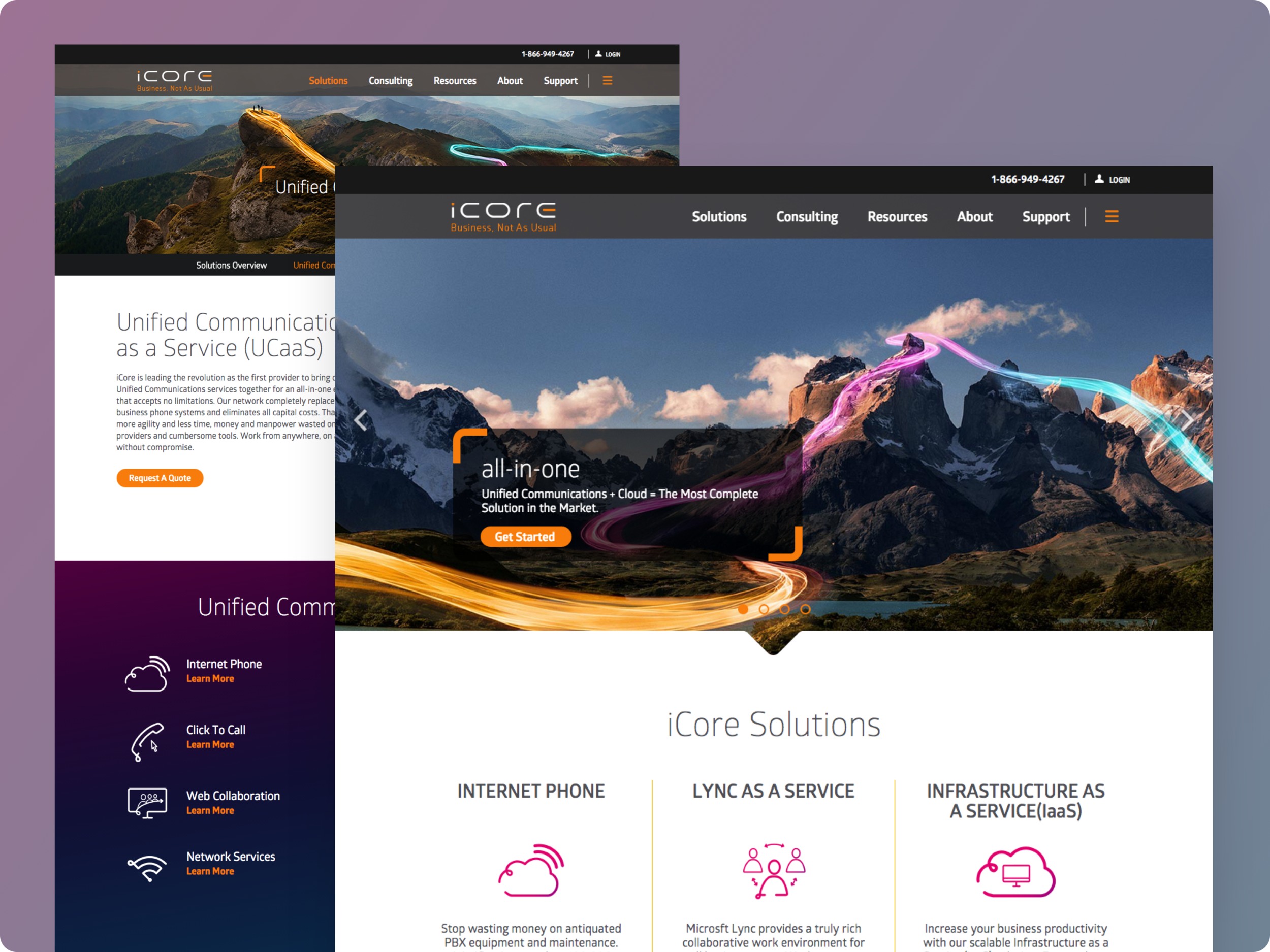
Who: iCore Networks
What: User Research, Testing, Information Architecture, Wireframing
Results: A streamlined site architecture and navigation that lead to better conversion rates.
Next up
Who: A Fortune 100 multinational bank
What: Prototyping, Workflow Improvements, UI Design
Results: The line of business marked a drop in the number of inquiries about this particular section, which demonstrated an increase in ease of understanding.


